Case Study

Improving First Product Experience

Redesigned the first product experience for a website analytics platform, encouraging users to sync their data channels, unlock personalized insights, and explore key product features. The redesign increased data channel synchronization by 20% and onboarding completion by 15%.

PROJECT SPECS
Icon
Product:
Diib – Website Analytics Platform
Icon
Challenge:
Improve product activation by redesigning the first dashboard experience for users with incomplete or unavailable third-party data.
Icon
My Role:
UX Research • Product Strategy • Information Architecture • UX/UI Design • Prototyping • Design QA • Analytics Review • Developer Collaboration
Template image
Business Context

Product Foundation

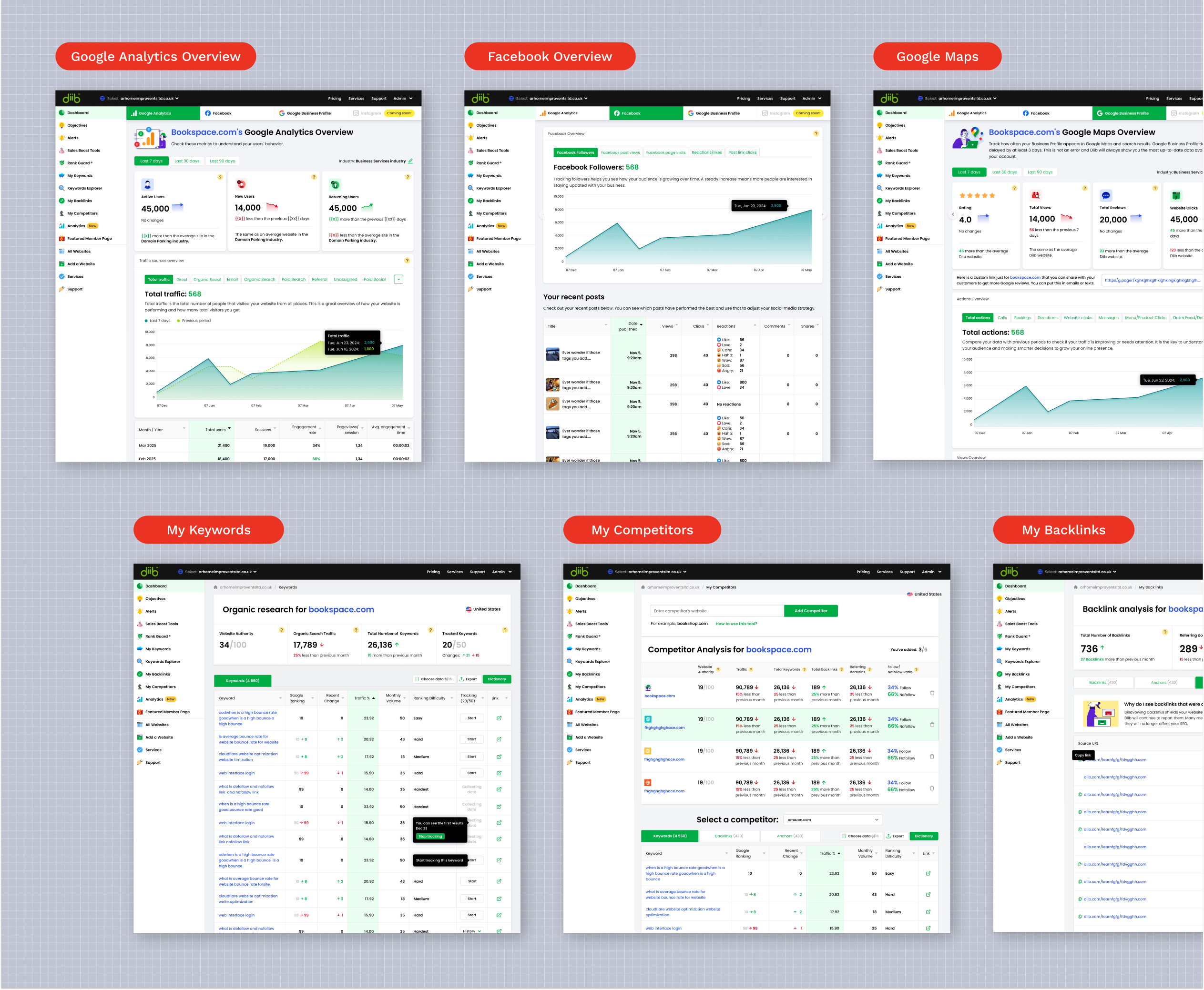
Diib helps small business owners understand website performance by bringing together website analytics, SEO, website health, and marketing data into a single platform.

To generate personalized insights, the product relied on third-party integrations such as Google Analytics, Google Search Console, Facebook, Moz, Semrush, and other data providers. However, because new users typically hadn't connected these channels yet, much of the platform's core functionality remained unavailable immediately after sign-up, making it difficult to demonstrate value during the critical first product experience.

Template image
The Challenge

Building the First Product Experience Around External Data

To unlock the platform's full value, users first needed to connect their data channels. Internal analytics showed that users who synced at least one integration were significantly more likely to engage with the product and upgrade to a Pro subscription. However, too many users abandoned the onboarding process before reaching that point.

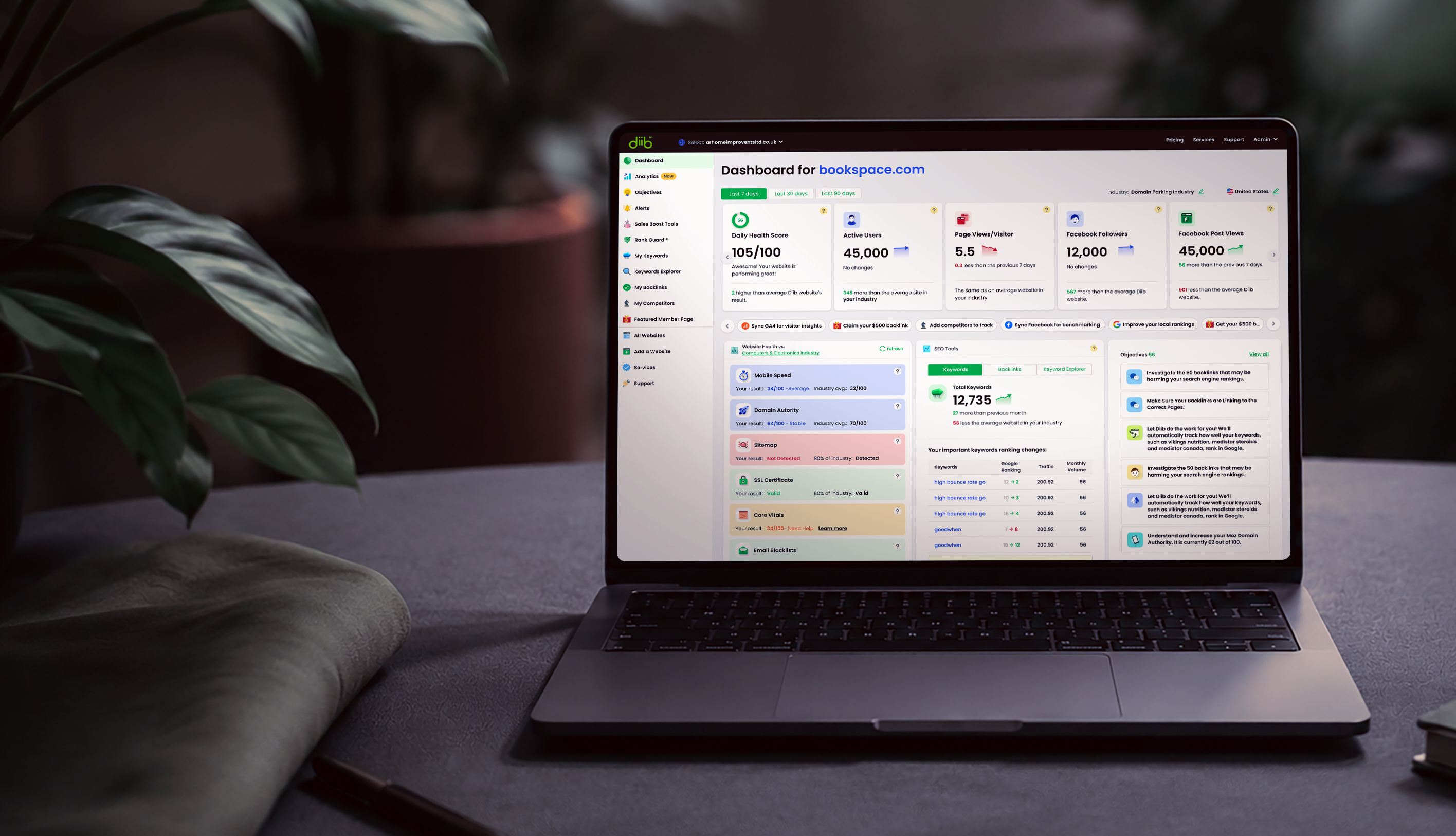
The dashboard—the first screen users saw after signing up—became the focus of the redesign because it represented the first step in the activation funnel. However, the existing experience had several critical issues:

1. No clear feature hierarchy.

The dashboard acted as a promotional space for product features rather than guiding users toward the most important next actions.

2. Poor experience for users without connected data.

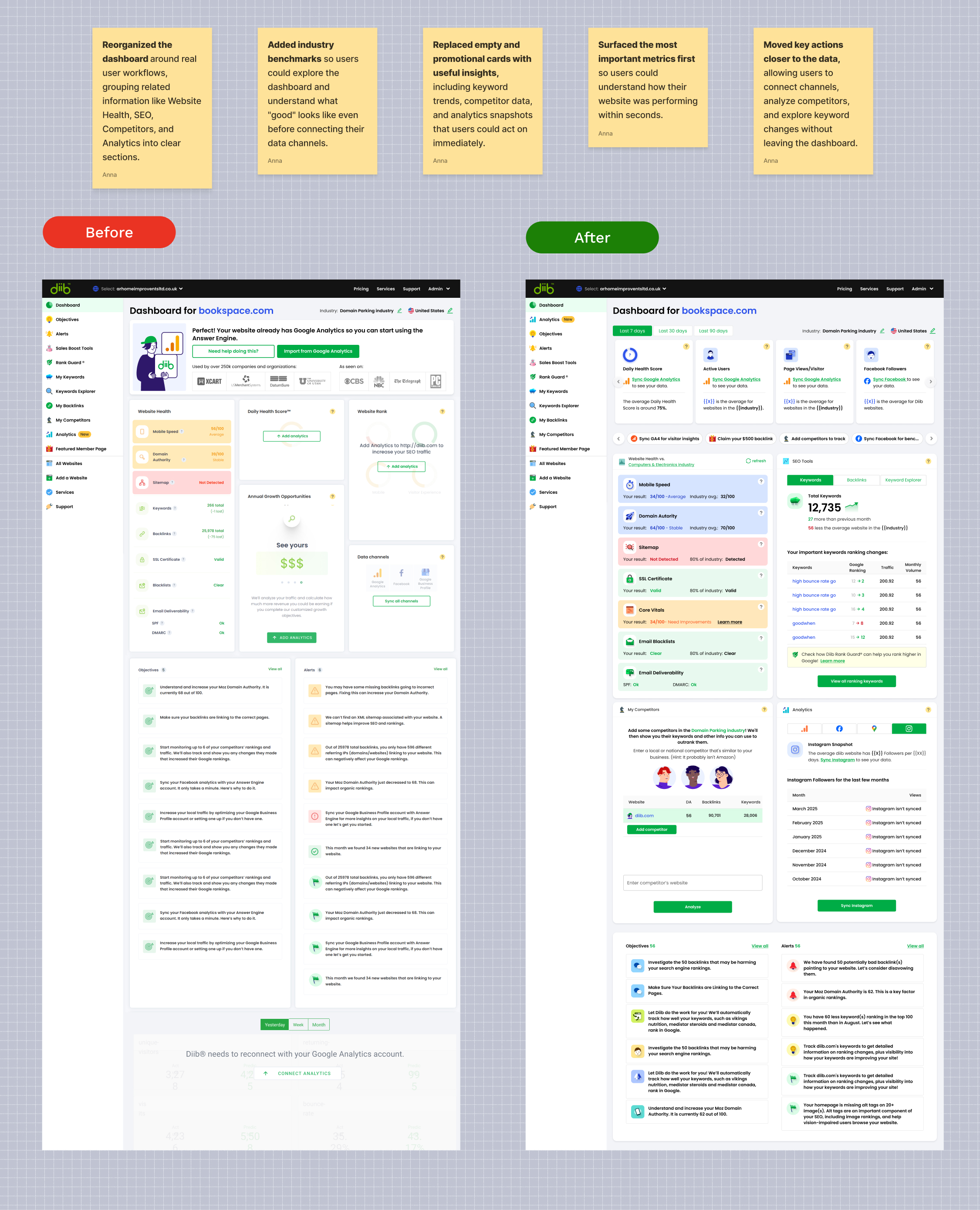
Since most new users hadn't synced any channels yet, large parts of the dashboard appeared empty or unavailable, making it difficult to understand the product's value.

3. Limited visibility into data integrations.

Users received little guidance about available data sources, why they mattered, or how connecting them would unlock personalized insights.

4. Inconsistent handling of third-party API states.

Authorization failures, loading states, missing data, and API errors appeared as isolated issues rather than expected system states, creating confusion and reducing trust.

The primary goals were to increase data channel connections, improve onboarding completion, and encourage users to explore key features such as My Competitors and My Keywords, ultimately increasing product activation and Pro subscription conversions.

Template image
Discovery & Research

From Insights to Strategy

Before designing solutions, I analyzed user behavior, collaborated with domain experts, and mapped technical constraints to understand where the onboarding experience was failing.

01. Funnel & Product Analytics

I started by reviewing onboarding and activation metrics to understand where users were dropping off. One insight stood out: users who connected at least one data channel were much more likely to continue using the product and eventually upgrade to a Pro subscription.

02. SEO & Growth Workshops

I worked with SEO and Growth specialists to understand what information users needed first and which features would have the biggest impact during onboarding. Together, we defined a clear content hierarchy for the dashboard instead of simply listing available features.

03. API State Mapping

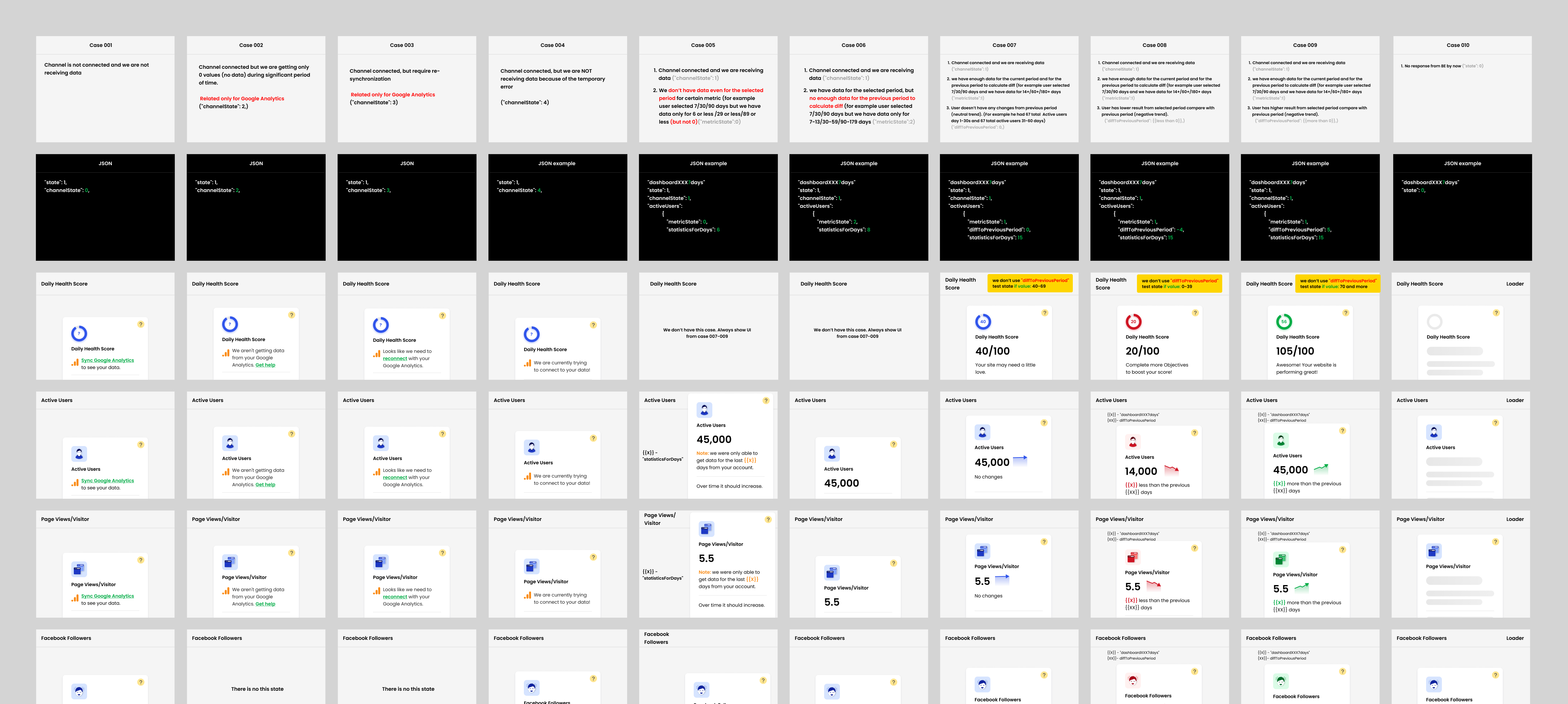
I worked closely with engineers to understand how each third-party data channel behaved. Instead of designing every integration separately, we established a consistent approach that every channel would follow. Together, we defined the key channel states—Not Synced, Synced, Waiting for Data, Authorization Required, and Insufficient Data—and treated them as core design requirements. This framework ensured that every dashboard widget handled the same user scenarios consistently, making the experience more predictable, scalable, and easier to maintain.

Template image

04. Information Architecture

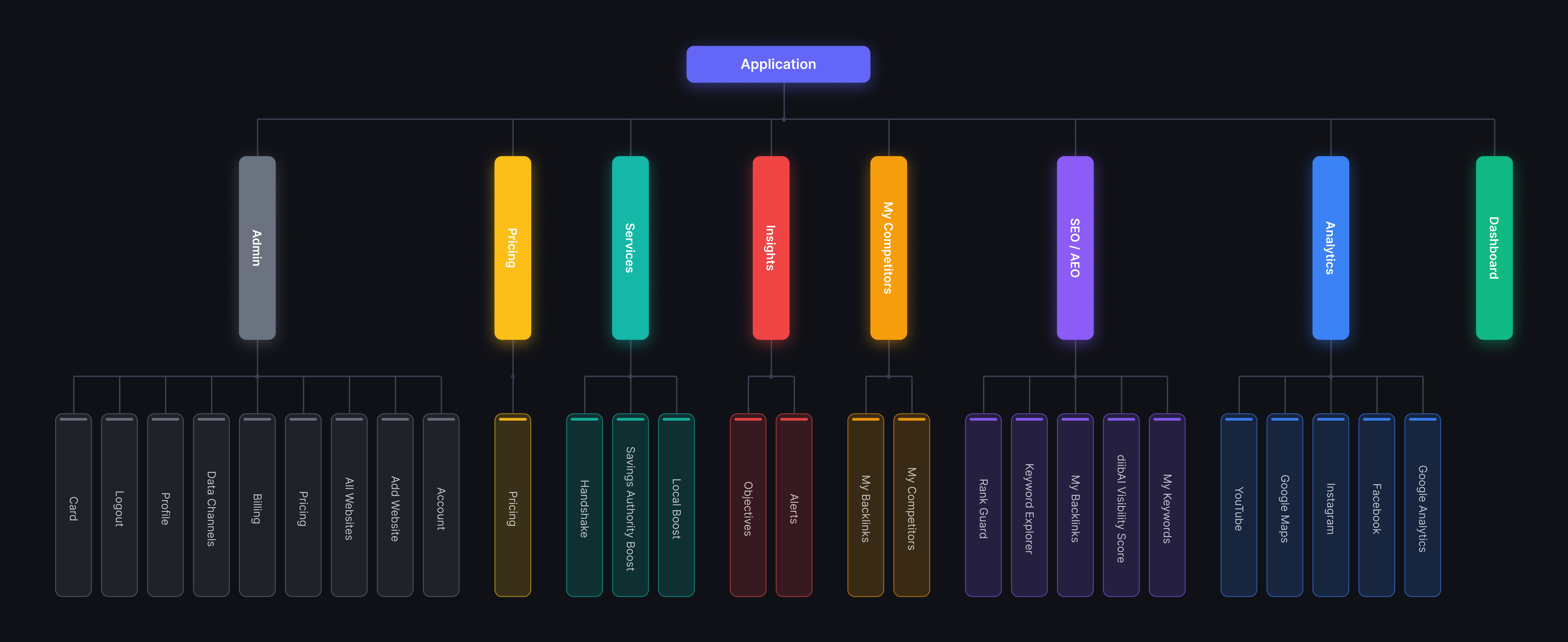
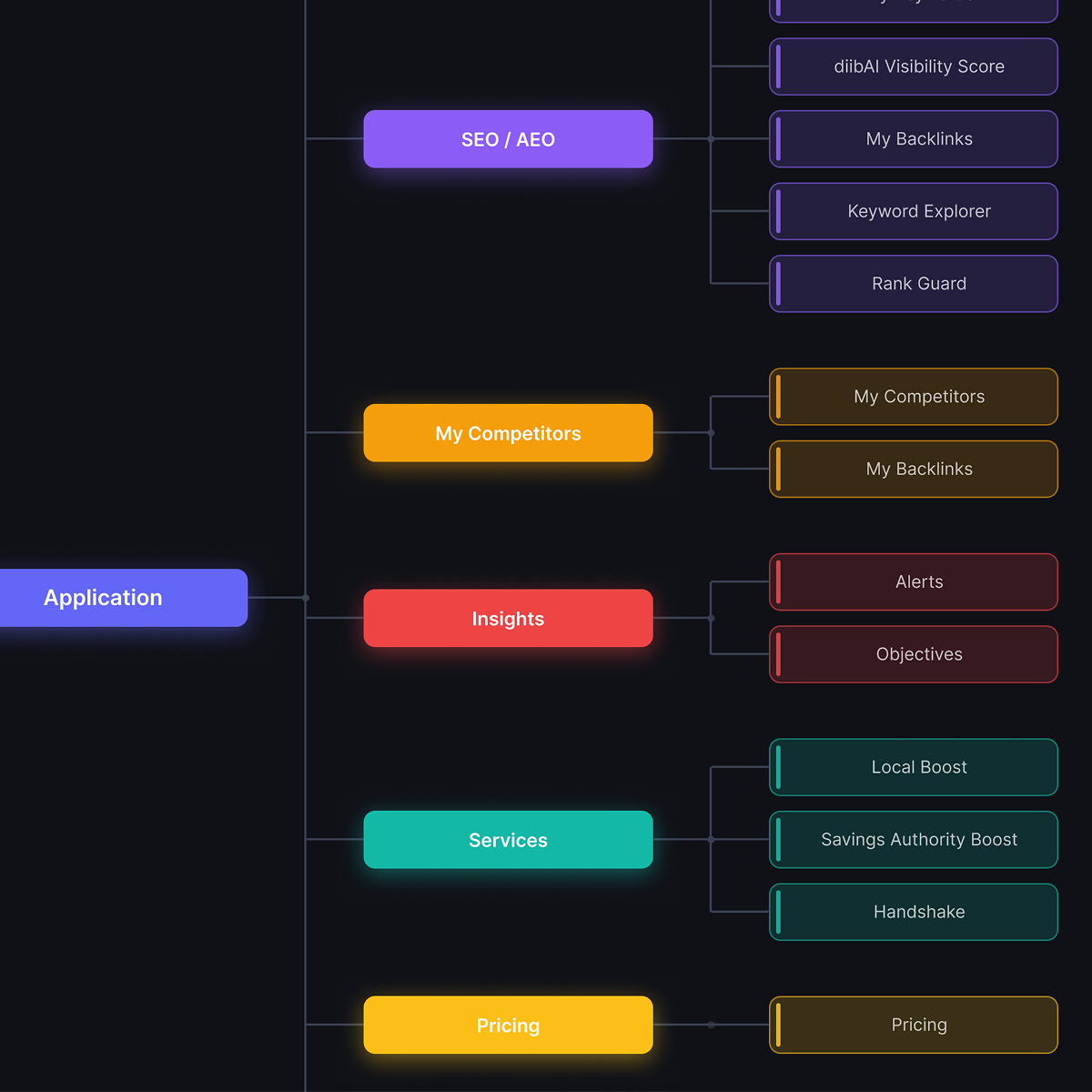
Once we agreed on the priorities, I reorganized the dashboard around the user's journey. The new structure guided users toward connecting their data channels first, then gradually introduced the platform's most valuable features and insights.

Template image
Designing the Solution

A Dashboard Built Around Activation

The new experience guided users from an empty dashboard to personalized insights through a clear hierarchy, reusable API states, and contextual onboarding.

01. Dashboard Hierarchy

I reorganized the dashboard around user priorities instead of product promotion, creating a clear hierarchy that guided users toward connecting their data channels before discovering the platform's key features.

02. Designing for Every User & API State

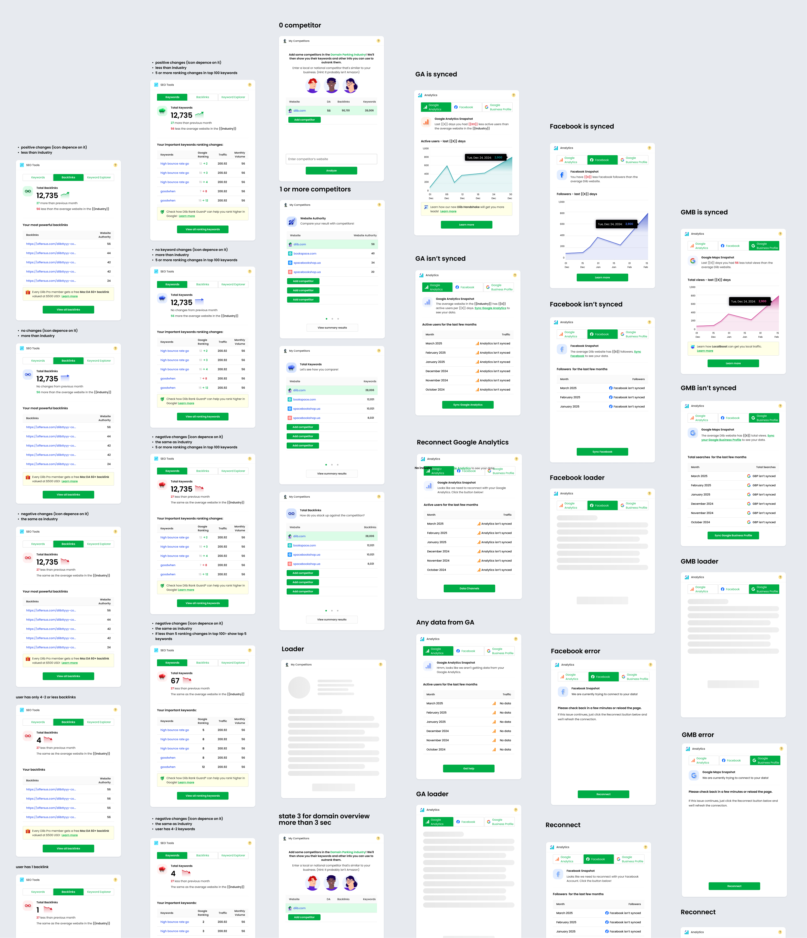
I designed dedicated experiences for the platform's key user scenarios—including first-time users without synced data channels, free users, and Pro users. To support multiple third-party integrations, I also created a reusable state model for every widget, covering Not Synced, Waiting for Data, Authorization Required, and Insufficient Data, ensuring a consistent experience across all data channels.

Template image

03. Creating Value Before Sync

Since most new users hadn't connected any data channels yet, I designed the experience to demonstrate value before personalized data was available. I introduced industry benchmarks, contextual guidance, and clear explanations of what users would unlock after syncing their channels, helping build trust and encouraging them to complete activation.

Template imageTemplate image
Result

The redesigned dashboard transformed the first product experience from an empty landing page into a guided activation journey.

By helping users understand the value of connecting their data channels, the new experience improved early engagement and encouraged deeper product adoption.

20% Increase in Synced Data Channels

More users connected their data channels, unlocking personalized insights, automated recommendations, and key product activation flows.

15% Improvement in Onboarding Completion

More users completed the first onboarding steps and explored core features such as My Competitors and My Keywords.

Scalable Dashboard Framework

Established a reusable dashboard and API state framework that supported future data channels while providing a consistent experience across all third-party integrations.